Materials and Lighting


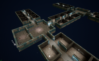
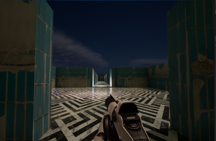
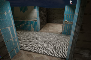
For this update I brought in lighting and materials alongside a more planned out layout for the map of the game. I am moving to the idea of creating an abandon asylum type of feel to this game by making twisting corridors repeating rooms and overall, a feel of a hospital. I chose to stay tiles and worn-down concrete for the materials of the game; however, I do plan to add in a more worn look or blood aspects to it later in development. I also chose to not have the game very lit to give it a more worn feel, so a few lights are working or barely working and makes it a little harder for the player to see and add into that spooky feeling. I hope to add some flickering to the lights later and also maybe some rooms completely dark depending on where the player is located in the game at the time.
Files
Get Indoor Level
Indoor Level
First project for Game Design 1 at Wichita State University
| Status | Released |
| Author | SavannahWolffWorks |
| Genre | Adventure |
| Tags | First-Person, Horror, Medieval |
More posts
- The timeless way of building addinsOct 17, 2022
- drives implemented into levelOct 03, 2022
- Improved LevelSep 26, 2022
- Updates to do for LevelSep 21, 2022
- Level Design Part 2Sep 19, 2022
- Modular Level DesignSep 12, 2022
Leave a comment
Log in with itch.io to leave a comment.